

Trippy, Edgy,
Attention-Grabbing
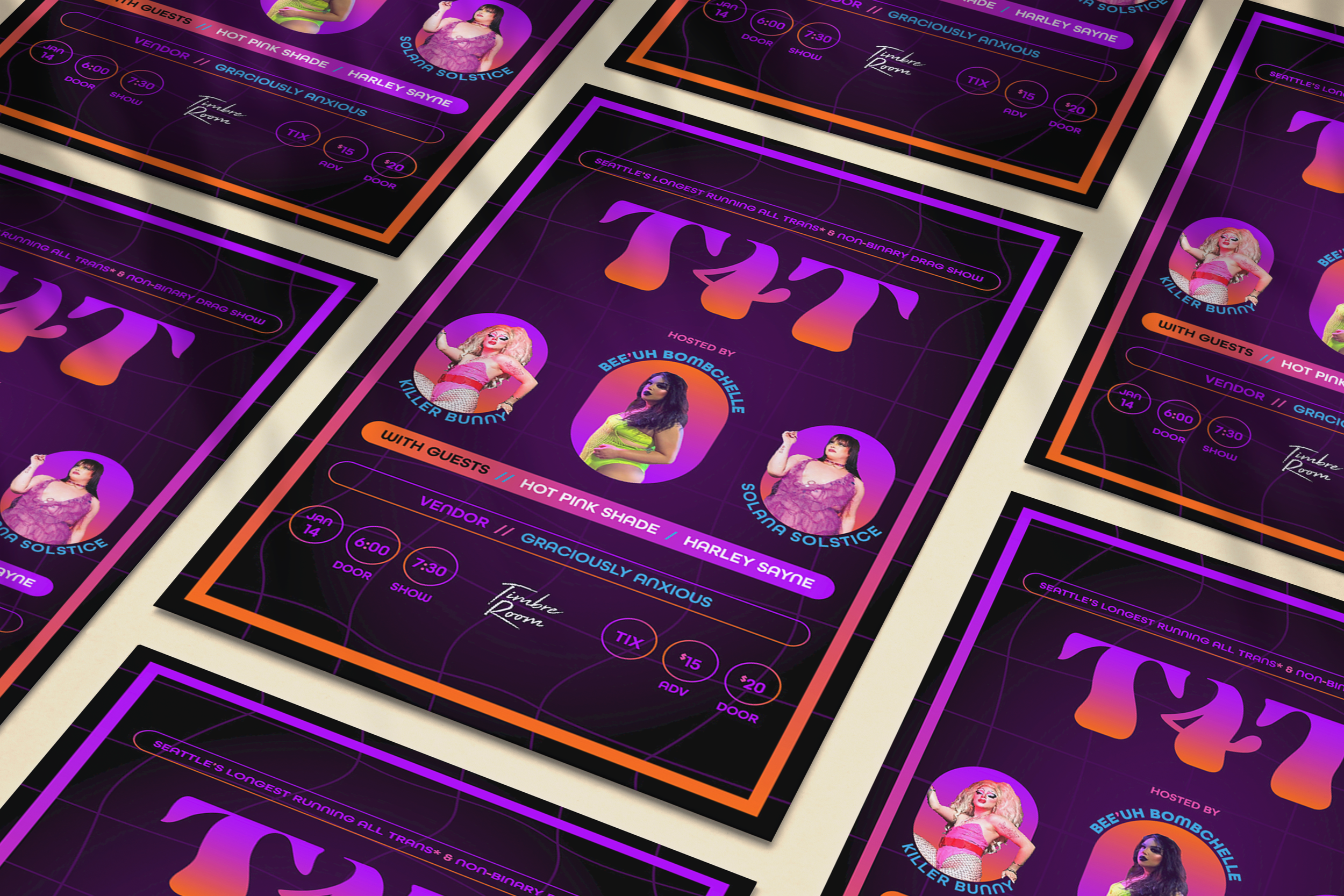
The client wanted to create a flyer for the drag show with a symmetrical design, a black background, and a bold, sexy style. She also wanted to include purple neon lights and a vaporwave feel.
We needed a design that could adapt to various marketing formats. The main focus was a 1:1 Instagram feed post, but we also required a story, a Facebook event banner, and a tabloid-size poster. We also created a cover for the ticketing app. For fun, I added some gradients for her stories while promoting the event.
Research
I made a Pinterest Board to explore common colors and elements in vaporware, dark, and psychedelic styles.
While looking at local drag flyers, I found that most featured performers with their backgrounds removed, giving the impression they were floating in space.

Design
After creating a mood board and editing the portraits, I offered three options.
We’ll frame them all
I wanted to frame these performers (or rather, put their pictures in frames) (not for crimes) to look cohesive with each other and to ground them in the rest of the design. The frames concealed odd cropping. I created duplicates of the performers' arms to overlay on the mask for a playful touch.
purple neon glow
I began with what she preferred. I used pill-shaped rectangles to frame the text and portraits of the main performers. The circles at the bottom also have a subtle pill shape. I added pink and blue accents to make it more eye-catching while keeping a harmonious color scheme. I liked the idea but thought it could be more trippy and attention-grabbing.
trippy, sexy
I created a warped grid as a subtle background to bring in the vaporware aesthetic. I noticed many vaporware images isolated single body parts so I put the title of the show in a 70’s style type on a tongue to play up that psychedelic and alluring prompt. I reflected one of the T’s for symmetry. The wavy type had formal similarity to the background. The portrait frame shapes reference the tongue above.
attention-grabbing
I wanted to introduce more color contrast as a way to create intrigue. First I added orange to the pallet and then I added pink in the middle of the gradient so the whole ombre looked vibrant instead of blending into a weird grey color. The orange really brought the design to life! I made the border thicker to further highlight the sunset gradient.
She chose the
third option
and we made some tweaks for the final draft. She wanted to use the wavy grid background to give the design more depth. I changed the body typeface to something a little more unique but maintained rounded characteristics. I also added the gradient to the show name for consistency and drama.


